Fumingtai
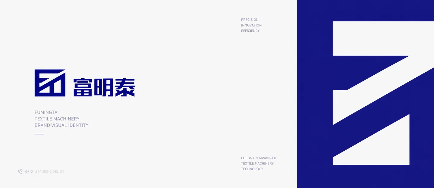
A logo refinement built on the company's existing recognition, improving structure and proportion for a steadier industrial brand presence.
Client
Qingdao Fumingtai Industry and Trade Co., Ltd.
Type
Branding
Project Notes
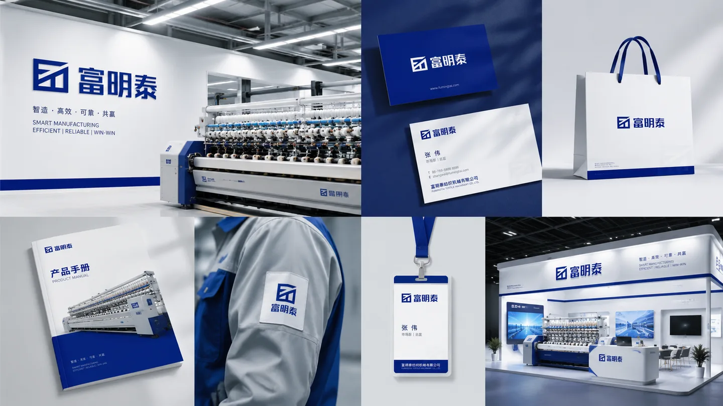
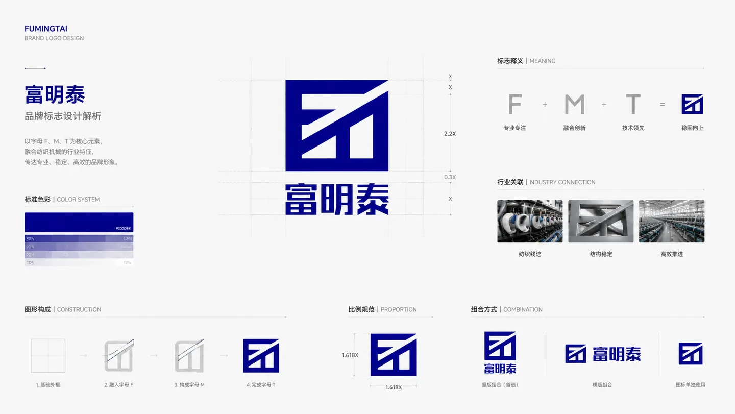
The Fumingtai logo upgrade was not about discarding the previous identity entirely, but about reorganizing structure and proportion on top of existing recognition. The updated direction is simpler and steadier, making it more suitable for industrial documents, equipment markings, and external company presentation.
Industrial brand upgrades usually matter most when they can hold up over time. Once the structure, proportion, and application logic are stable, later extensions across websites, brochures, equipment tags, and offline materials become much easier to keep consistent.
Next case
ReachOne